W'S Bakershop Website Redesign/Strategy.
I redesigned the ordering experience for W’S Bakershop, a bold, social-first cake brand, by turning scattered DMs into a smooth e-commerce flow. This case study shows how UX strategy and visual identity came together to boost conversions and customer delight.
Context: Who and Why
The Client:
W'S Bakershop is a local bakery known for its playful, hand-drawn cake designs and witty, sassy text. Their cakes often go viral on social media, but the brand lacked a website, meaning potential customers had no easy way to order.
The Problem:
The business relied solely on Twitter and Instagram DMs to take orders — a process that was inefficient, inconsistent, and unscalable.
Challenge & Constraints
No existing website or online order system.
Limited access to internal data (self-initiated case study).
Needed to build user trust through design without direct business input.
Despite these constraints, I wanted to approach this like a real-world UX Strategy problem; aligning user needs with business objectives through thoughtful design.
Goals
User Goals:
Easily browse cakes/snacks.
Quickly place orders with minimal back-and-forth.
Get clear info on pricing, availability, and delivery options.
Business Goals:
Increase online orders and revenue.
Build brand consistency beyond social platforms.
Expand customer base beyond followers.
Research & Discovery
🧠 User Research
Using secondary research and assumptions based on online customer behavior, I identified key user needs:
Demographic: Young, internet-savvy individuals who value humor, aesthetics, and convenience.
Primary Tasks: Browse product categories, view pricing, place orders.
Motivations: Celebrate events, gift loved ones, satisfy cravings, create memories.
🏢 Business Analysis
Strengths: Bold brand identity, engaging on social, standout cake aesthetics.
Gaps: No online ordering, inconsistent experience, missed conversion opportunities.
Success Metrics: Sales growth, reduced DM-based ordering, improved customer satisfaction.
Strategy & Process
I adopted Joe Natoli’s UX Strategy framework:
🗺 Project Planning
Defined success for both users and the business.
Identified key touchpoints where experience needed to be smooth and branded.
🧭 UX Strategy Principles Applied
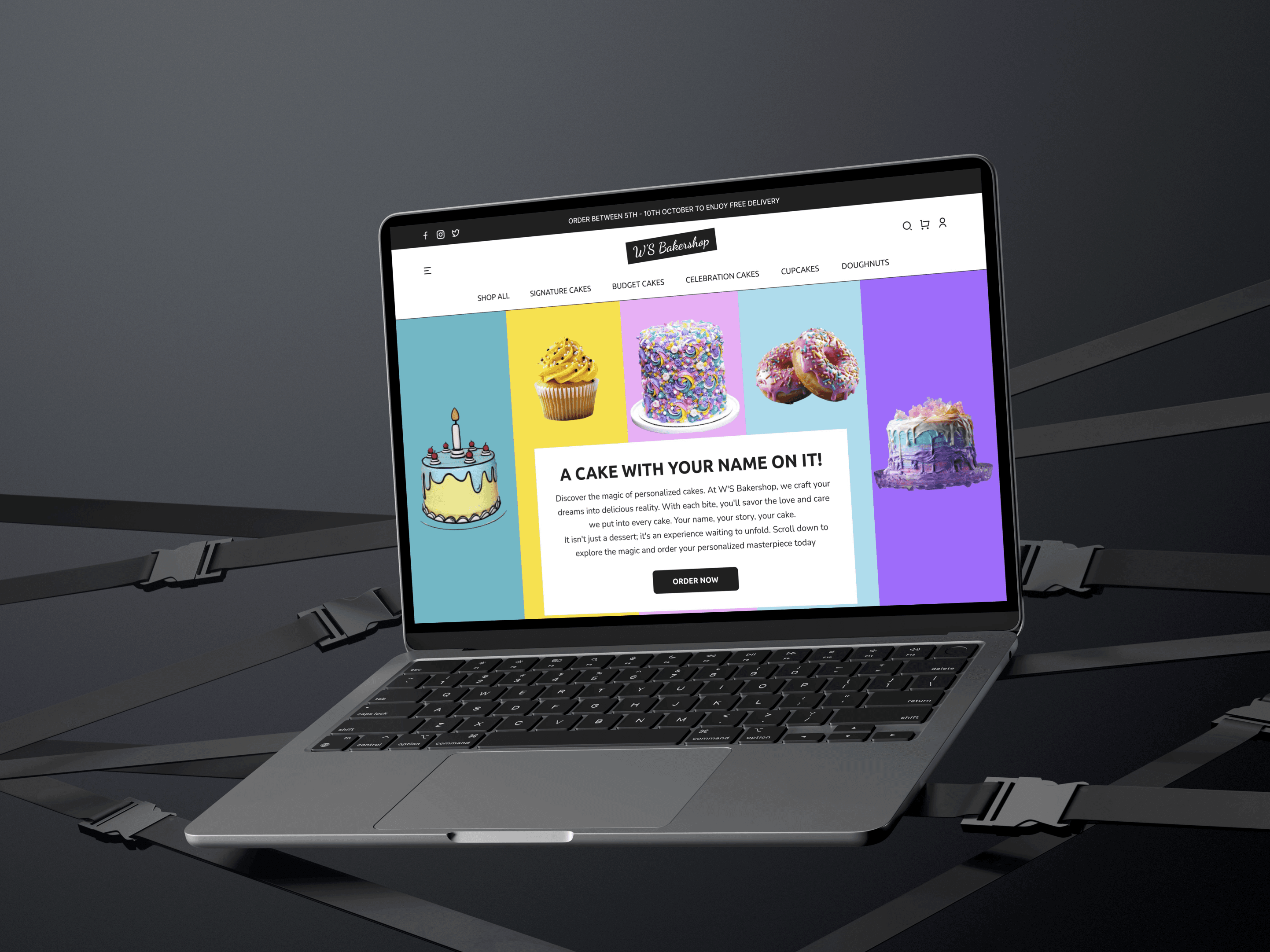
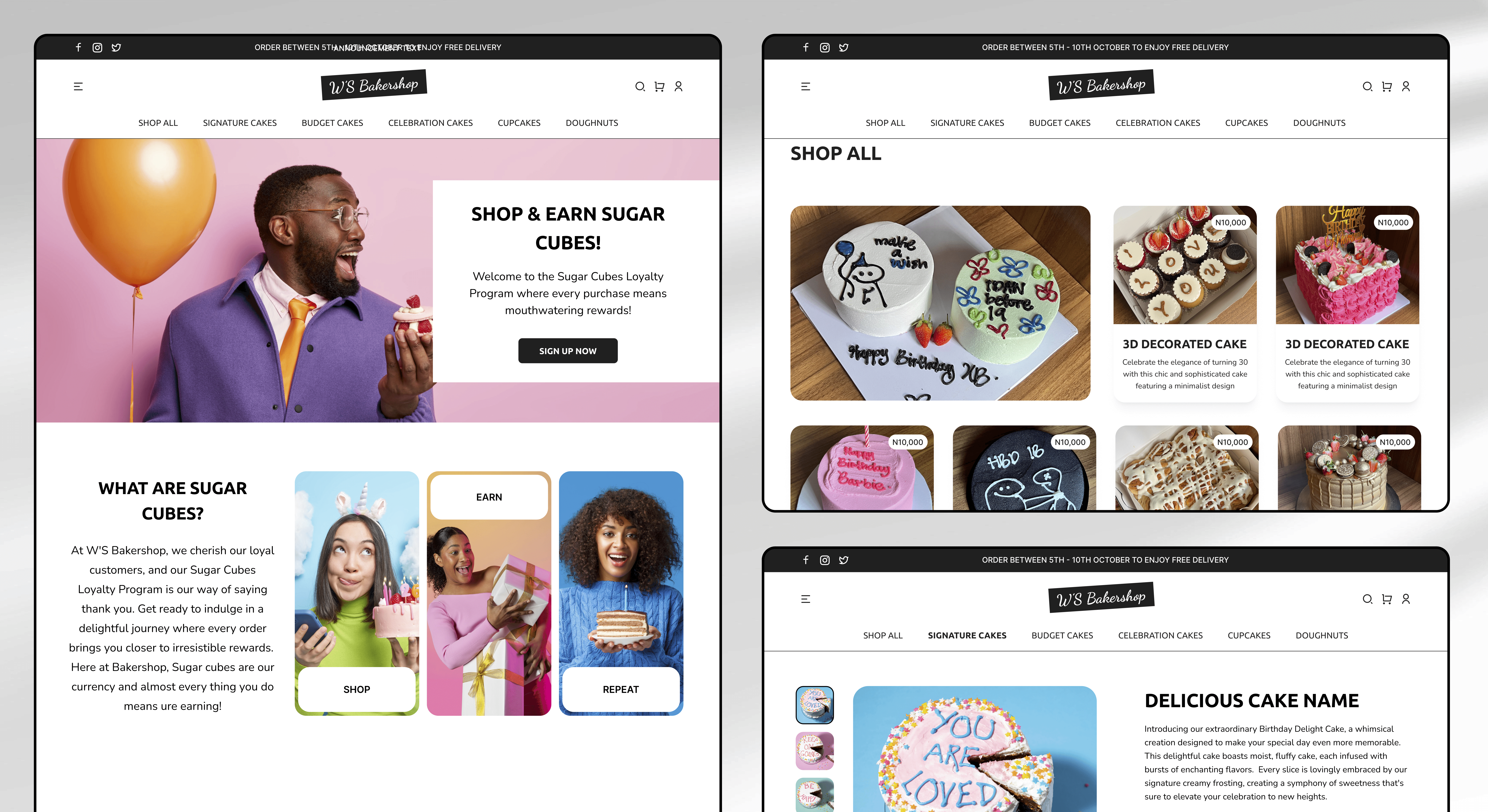
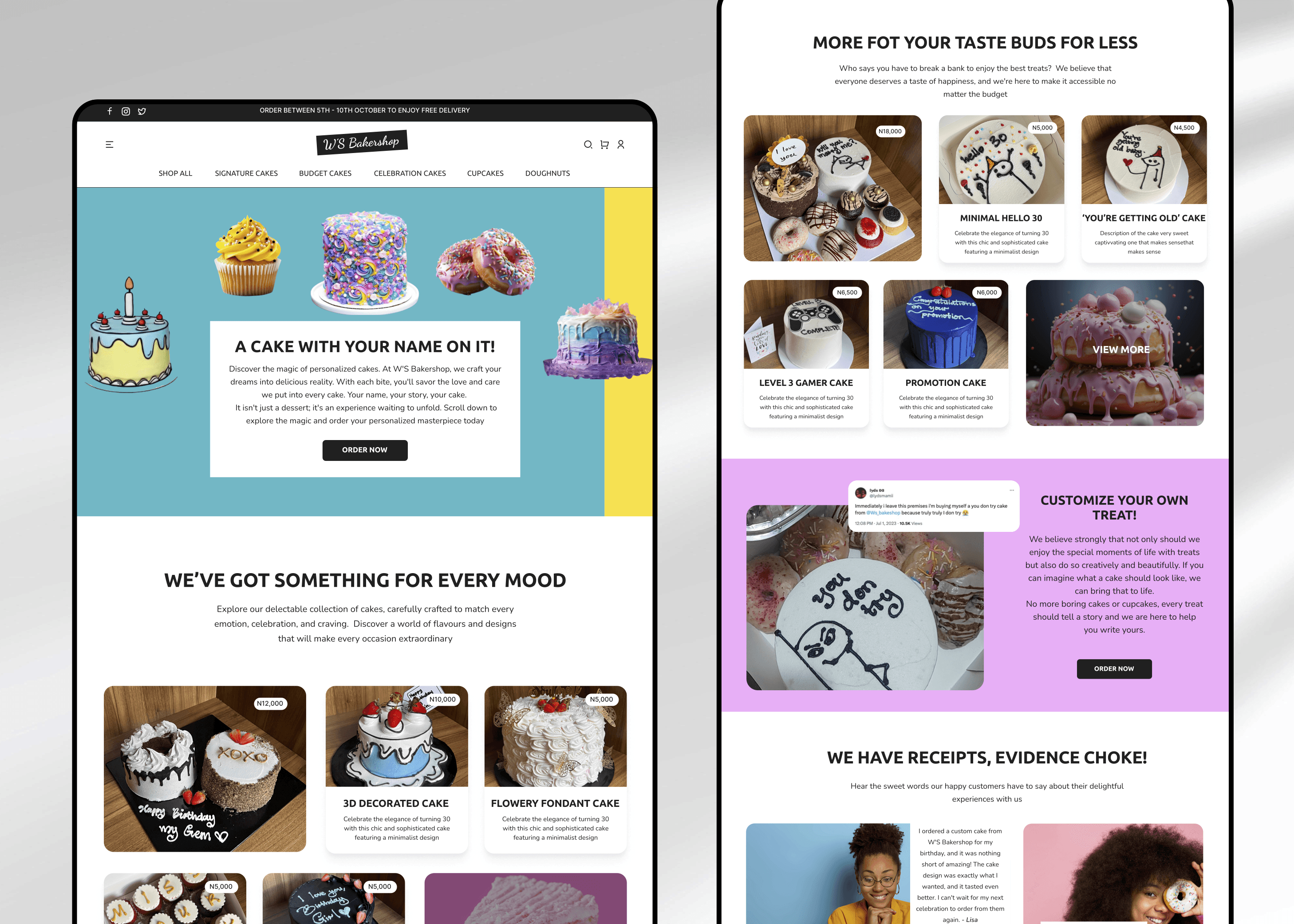
Designed flows that reduce friction — e.g., “Order Now” appears on every product page.
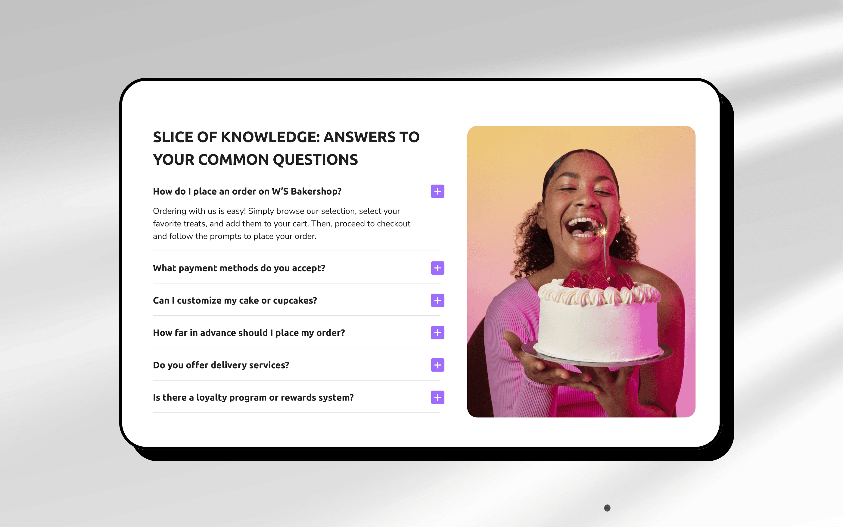
Applied design psychology — trust signals, familiar interactions, clear hierarchy.
Ensured the tone felt playful but professional, matching W’S Bakershop’s social voice.
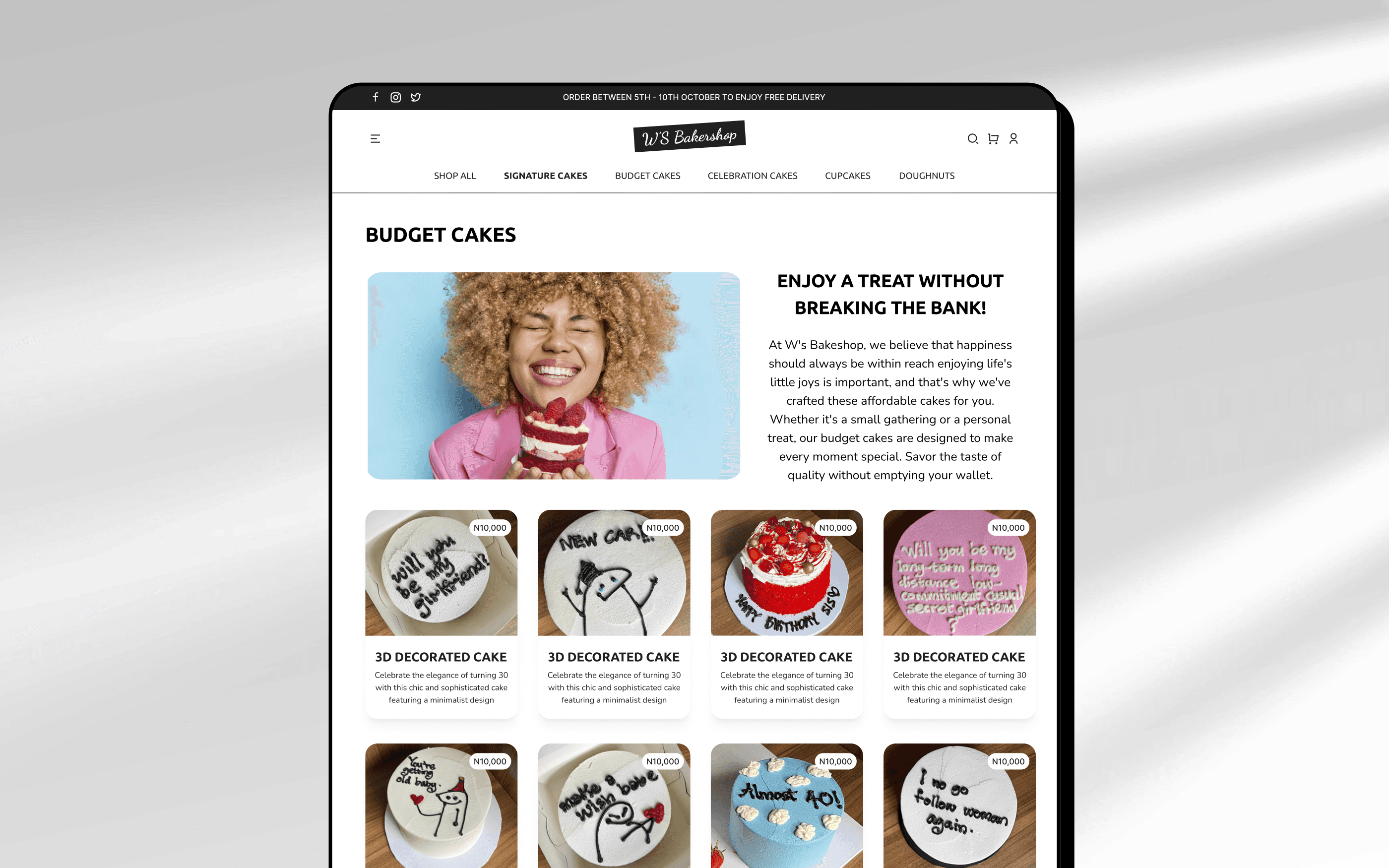
🎨 Visual Direction
Inspired by brands like Milkbar.com — bold color, minimal layouts, image-heavy.
Created a fun but clean design to reflect the brand’s tone: celebratory, witty, minimalist.
Key Decisions
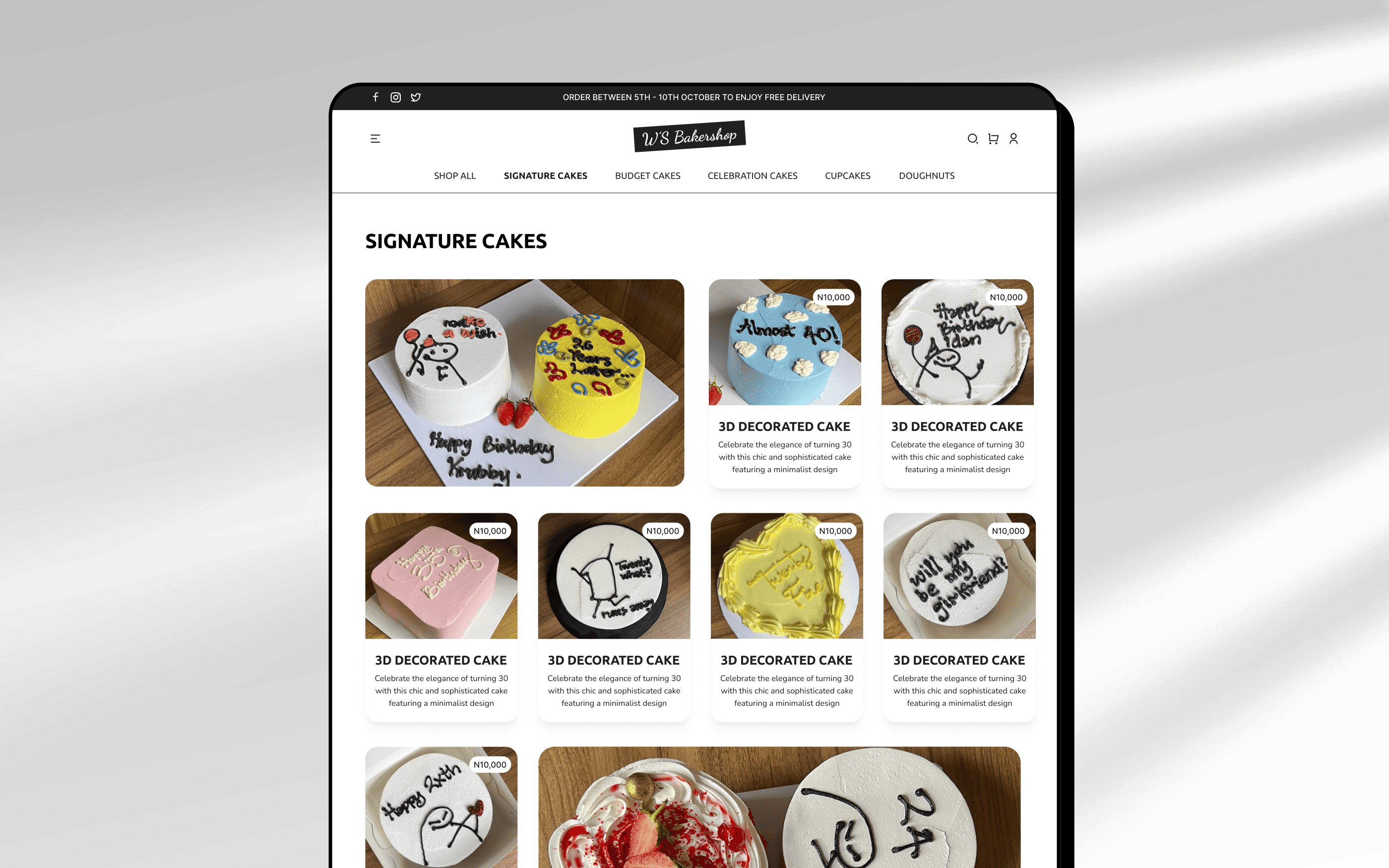
Navigation: Minimalist layout with floating cart and sticky order button for mobile users.
Imagery: Large, unapologetic cake images so the product sells itself.
Copy: Used sassy, friendly tones (e.g., “Sorry, not sorry, we only do awesome.”) to stay on-brand.
Order Flow: Simplified 3-step checkout to reduce drop-off and mimic DMs but better.
Reflection
I learnt a lot during this project, what stood out for me was there is no single approach to product design and each project is unique and so should the process be.
This project taught me that strategy is not about deliverables, it’s about clarity. It’s about defining what matters and focusing the design on making it happen.
What I’d do next:
Conduct usability testing to validate assumptions.
Possibly integrate an order tracker or personalized cake builder.
Until then, keep it sweet 🍰